
I think the wood might have a lot to do with it. If it’s worth it, a nice sanded finish might help and then a treatment of lacquer might even out the tones in the wood.
What is your power minimum for greyscale.
It’s like you get the contrast with the dither and the almost photographic from the greyscale but you need both qualities for impact.
There are multiple issues with wood, especially the stuff I am using.
For testing I use scraps, which are usually the backsides from other projects. They consist of veneers that are butted together causing drastic changes in the image, and glue joints that show up as white lines in the images. You can see them in my finished pieces.
Pretreating the boards helps some. I have done that on some things I have done before, but not worth it in my tests.
Those settings are similar to what I got, but I do like the simpler interface. It is a lot better that LB controls. I wish LB would at least give us a histogram so there is a little more feedback when you change numbers. An interface like photoshop would be a whole lot better, and your adjustment interface is close to that, but uses numbers.
I use power settings max 65 min, because I don’t want to burn craters in the shadows and 0 or 5 even 10 sometimes depending on the highlights in the image.
I started using images instead if tracing images, because you can achieve detail that you can’t get with tracing.
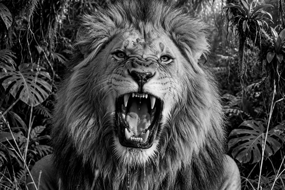
The image below consists of several Ai generated images and text added.
The images are the dealership, the 2 men standing outside the door. All the cars outside. Each element is its own image. The cars I did a trace of the each car then used elements from that tracing and cut shapes to knock out the windshields. A lot of work, but the end result was great. The text I had to distort to make it fit the areas. The only text I didn’t replace was OPEN and ENTRANCE by the door. The hardest part was to get Ai to change the viewpoint of the police car without the text being backward on the side of the car. The best part of using images when they overlap you don’t have to knock out what’s behind them, making it easier to scale and move them around.
By the way all images are grayscale even though the look like they could have been line art. They are pretty much black and white, but the antialiasing along the edges of the lines give it a smoother edge. At least that’s my take.
I get the most fun from pushing the boundaries of what I can do with the tools that I have. I do have a version of photoshop that I could use to play with images, but it is on a different computer, and I have affinity software which I haven’t used and haven’t spent the time to learn. I’m 79, and teaching an old dog new tricks is hard.
This was created for a friend that was born in 1958 and collects 1958 items and his last name is McCann. This was burned on the good side of the Plywood, and had little grain problems, and yes I did spray a couple of coats of poly on it first.
Better lit image, still not the best.
That’s a very interesting and thought provoking set of comments there Jay, and it’s going to take some time to tease out the points worth noting. The work with combined images and line manipulation is the most excellent way to hone the skills and make fuller use of the tools. The muddy area either side of the line is most important…that’s where Rick’s image indicates what’s important about contrast and when the contrast is found the next is gamma. Those image software packages don’t use a pipeline for no reason. And of course, 'garbage in/garbage out…if the original doesn’t have a certain quality to begin with, then Ai becomes useful.
Rick’s image of the sliders gives a good indication of the recipe and the amounts are dependent on the material. That’s what got me started with CLUT’s and Palettes. Ai does it easy but I’d like to develop it manualy…for the knowledge.
The muddy areas in that image are caused by the iPad camera flash. It was taken in a darkened room.
The piece looks fine. I took the picture at 3:00 a.m. in my office.
See updated image. Still a bright area in the lower right, but better.
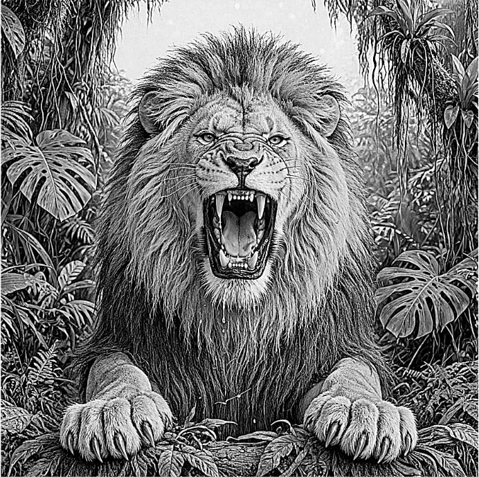
Back to the Lion.
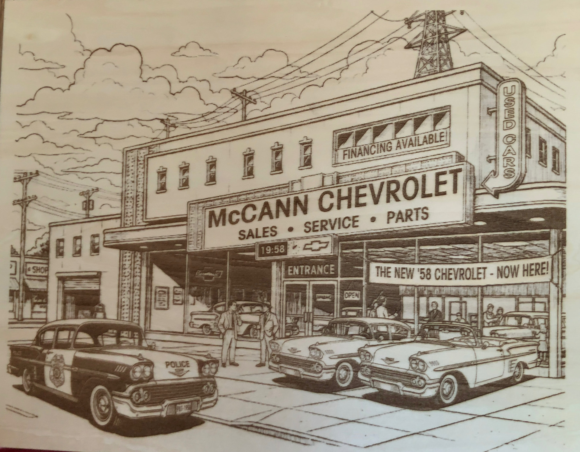
I brought the color image into LB and applied these settings
DPI 254
Contrast 0
Brightness 0
Gamma .800
Enhance Radius 5
Enhance Amount 260
This is a screenshot of what I sent to Diode laser.
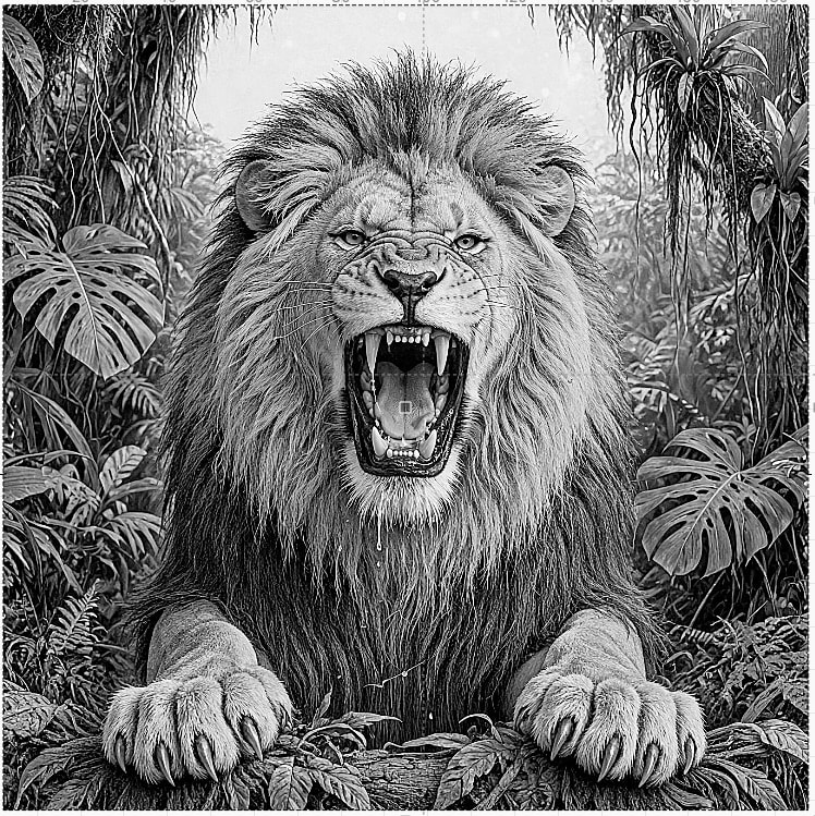
No overly dark shadows, and balanced mid tones and highlights.
I shoot for no darker shadow to be more that 70% because anything above that is the same shade. By doing this the histogram gets spread out. Then when it is output the power setting are supposed to be match to the images histogram.
I hope that makes sense, because it seems to work.
The only way to really compare is to burn both images and see the results and compare. WYSINot alwaysWYG.
The one sent using Atkinson pretty well matches the above image, but I am shooting for a true grayscale image burn. It probably doesn’t make a difference, but I want to push that envelope and see if thes settings can be universal.
If you look at the grayscale burn, it is still on the dark side. I may even try power settings max even lower and see what that does for the finished product.
Histogram of this image.
Give me a histogram of this image
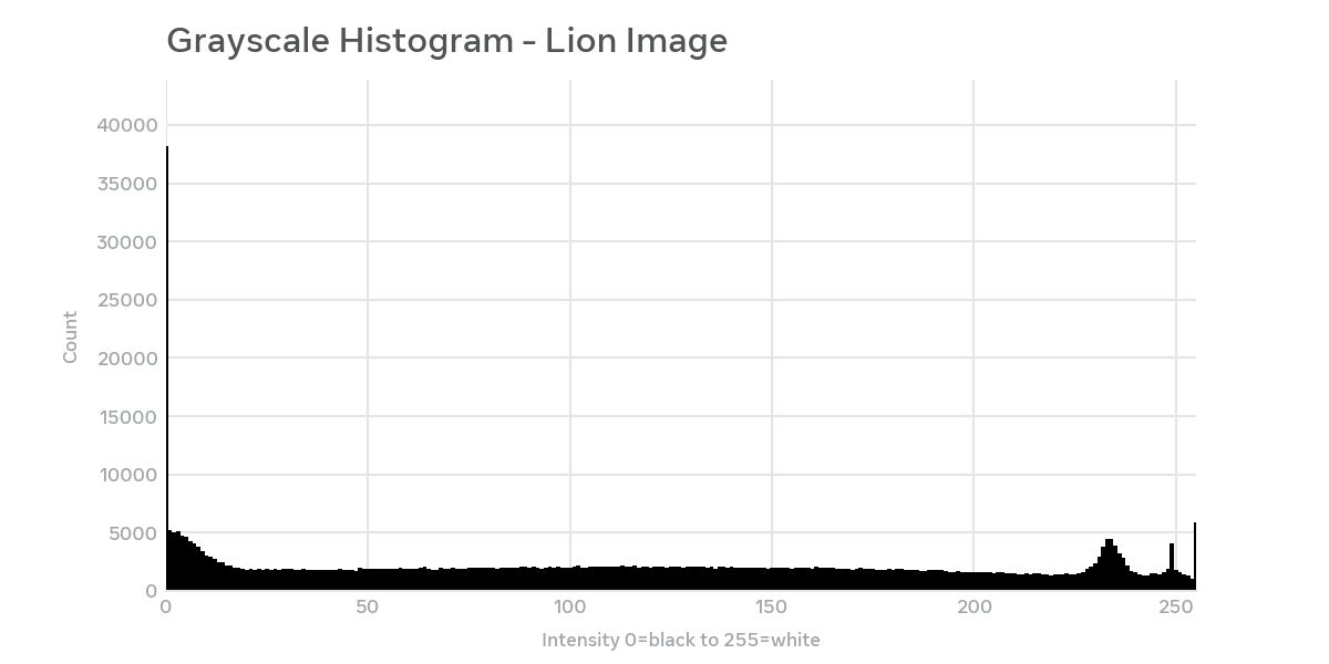
Here’s the histogram for your lion image: Not what I expected.
What it shows:
This is a grayscale image (0 = pure black, 255 = pure white) - 749 x 748 pixels, 560,252 total.
- Mean intensity: 113.8 - slightly dark of middle gray
- Std dev: 80.3 - very wide spread, which makes sense for this high-contrast engraving style
- Min: 0, Max: 255 - uses full tonal range
Shape interpretation:
- Big spike at 0 (pure black) ∼38k pixels - the deep shadows, outline, and darkest fur
- Very flat, broad middle from 20-210 - all the detailed mid-tone hatching in the mane and jungle
- Small bump at ∼234 - the bright sky/background
- Spike at 248-255 - the paper white highlights
That flat mid-tone distribution with peaks at both extremes is typical of a detailed ink drawing / lithograph - lots of texture, not a lot of smooth gradients.
Excellent! But is it the distribution on the image that accounts for clarity. The histogram is a revelation, it obviously shows that my idea of getting rid of all the midtones with palettes andCLUTS is more or less unnecessary. It has to be the arrangement. That’s helpful for prompts to ai, but may also indicate what’s needed for manual work in the processing.
By the way, the previous comment on Muddyness was concerning images in general, esp greyscale…not your image specifically. I also would have presumed the muddy would be in the wide span of midtones shown in your histogram…but obviously not
Your recognition of the pattern from lithography at least gives some certainty of what’s occurred. What area of study would enlighten further on that subject.
Have you tried reducing the dpi if the image is returning a bit to dark. The dot size and burned spot size won’t match, especially on soft organic material. 231 is worth a go and keep power as is.
WYSIWYG…the Grail! is where all this began for me and it looks like ai will be indispensable for a good workflow.
The laser dot size @ 10W is .08 thus 254 is ideal. I don’t know what I would use, but on soft wood like basswood would make a different if I were to do this on Baltic birch or Maple. I think you use up all you material testing, then you by more because you use it up. It’s a vicious cycle, and the supplier laughs as he deposits your check.
I still have a couple of tests to try. One will be lowering the LPI/DPI. Maybe try it on some birch ply.
I managed get the grayscale stretched out according to the histogram. I thought I had it spread out more than that. Lowering the max power should in theory create more contrast in the shadows, but I don’t know what will happen to the highlights. Getting the right balance is the key.
I allow 20% Lpi/Dpi over the dot dimensions to give elbow room when burning at 100% of the power range settings so that could be a little muted between Midtones and highlights but compensatory for the shadows and blacks.
I think you could burn a whole football field of sub optimal material and still be in doubt.
The images above, that are crisp and well defined should indicate the best palette and histogram and at the end of the day, the most appreciated image engraving (per material) trumps logic. I’d actually consider doing a binary example (just to see), A greyscale darks only followed by a midtones only example, and a double run at 60% of the original power for the first and followed by a repeat 30% power (of the original power), if the original power was dialled in as much as possible but still not satisfactory.
These are from your last lion above, on a prepared slate that is glassy smooth and blacked. The top one is optimised to my dot (20w) and the lower one is 0.1 square dot.
No image adjustments in LB or Gimp…other than resolution. Sorry about the chipped edge running into the image, I must find it important to always forget something.
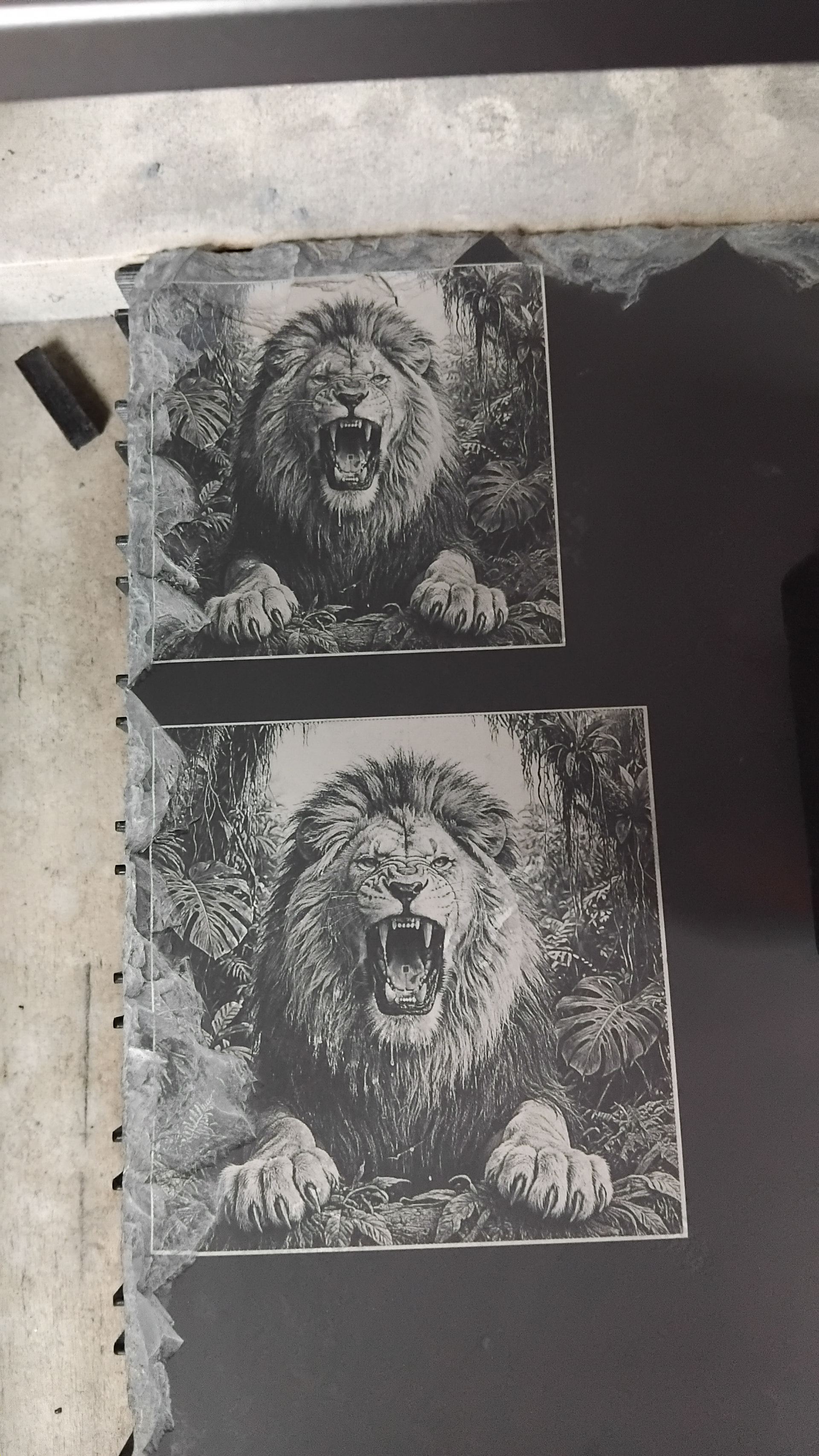
They both look really good on the slate. I certainly wouldn’t go to much trouble to improve from here unless looking for something specific.
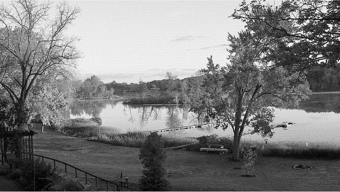
Ps. What was the print size of your back yard ai image above I recon my upscaling did it no justice and maybe Abe also.
Wow the Lions came out great. And that last one was a screen shot of the image I sent to my laser. 748 x 749 pixels.
Very interesting I am going to have to take that image with no changes and send that to the laser. Lower resolution may make a big difference in the end product. HMMMM, I see another rabbit hole in my future..
I am also forgetting something. I have started to run each layer sometimes, just in case I realized that I forgot something.
The image size on my backyard is 3300 x 1825 pixels unless The forum changes size when posted.
When you say blackened, what are you referring to?
I blackened the slate with ink to get a uniform finish as there was a bit of a frosted look about it in places…Newbie grinder’er. The wet grinding is I’d say the way to go, the dry grinding dust is killer…Literally, but the smoothness is 100%.
Screenshot! Well we’ll, I suppose black is black, grey is grey etc etc…could you run the screenshot to get the histogram and compare.
Would a depth map serve better for analysis than a standard histogram which is tones No and Qty only!
If you could get yer air buddy to redo that to 260mm high x approx 170mm wide I can run it on the slate to get a much clearer view of the details.
You do realize this is a square image. 260 x 170 not so square.
AI default res is 300 DPI which would make this to be 10.25”
260mm wide at 96 DPI
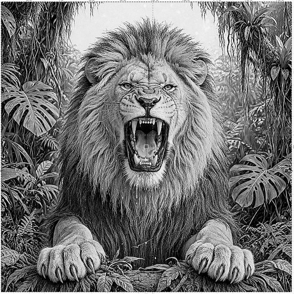
Below 260 mm at 72 DPI 981 x 983 pixels wide.
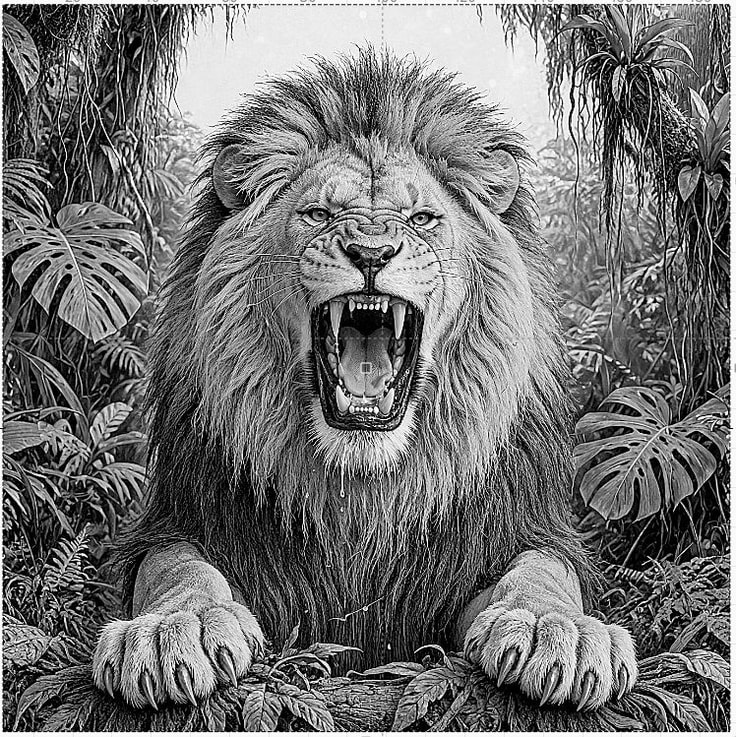
The one you imaged was 748 x 749 DPI wide and tall.
So dimensions need to be in pixels/DPI not in MM or Inches.
It’s getting confusing? I think the bottom of my rabbit hole has turned into a black hole. I’m getting too many copies to remember which is which.
I bet you didn’t notice the pail dashed grid lines and the dot in the middle of his rounded in the image. I had LB grid turned on when I created the screen shot.

Starting a new series. I have way too much lion images to know what we are working with.
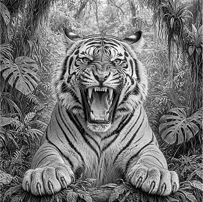
New default color image which I won’t run through Ai other than to relate this image.
Everything I do to the grayscale conversion will be done in LB. If the is a need to resize the image I will need to know what size at what DPI. I will try to make a screen shot of the adjusted image without the grid and dot on the tongue. NOTE! You can’t count on Ai to do everything correctly that you tell it. I told it to use the color background in the lion, it sorta kinda did it, but filled in the top part of the jungle.
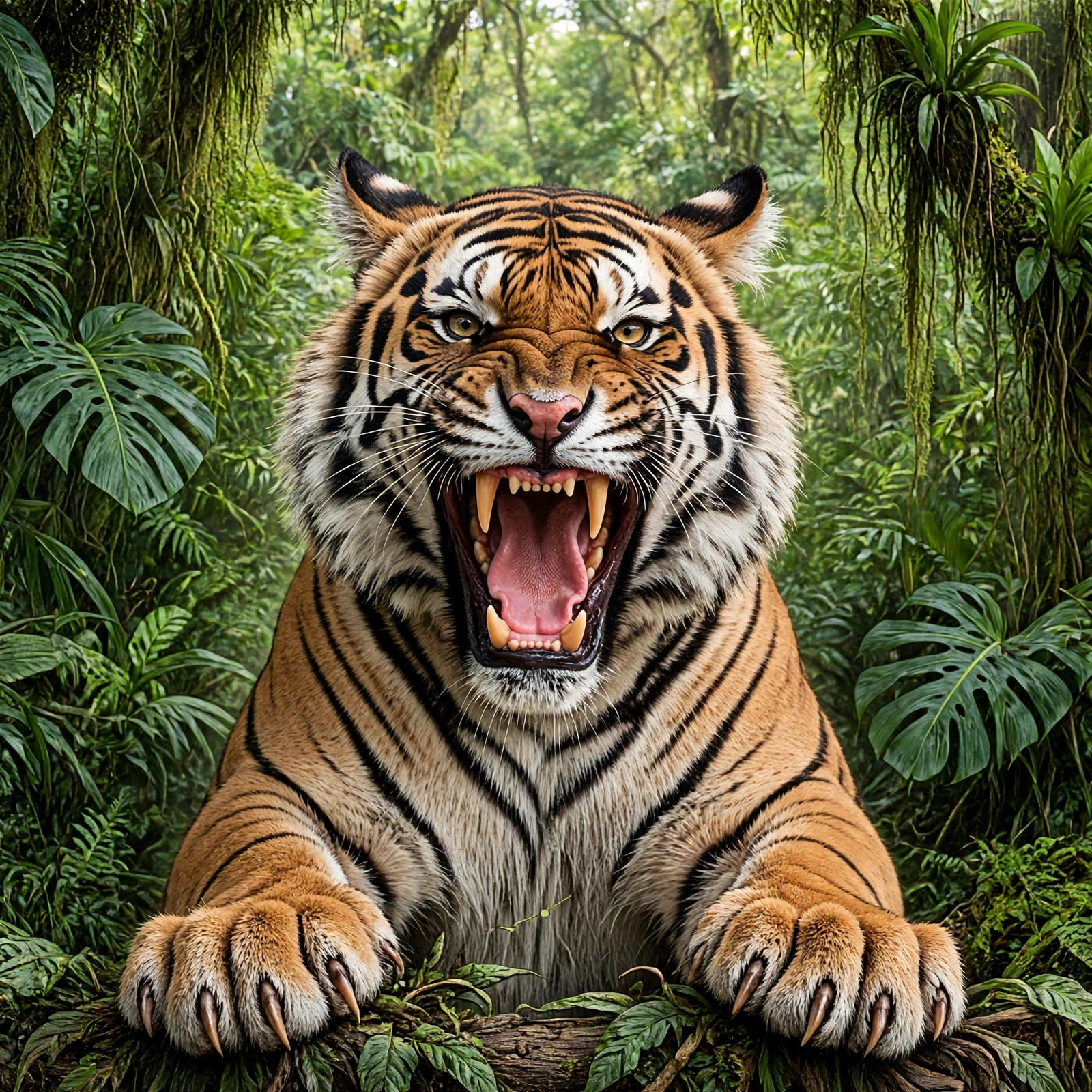
screen shot after my LB preset same as the lion was applied. 691 x 689 DPI/Pixels
Here is a new screen shot of the lion. 692 x 689 DPI/Pixels
Not quit the same but doesn’t have the grid.
our house same process screen shot LB only from original color image 1152 x 651 DPI/Pixels
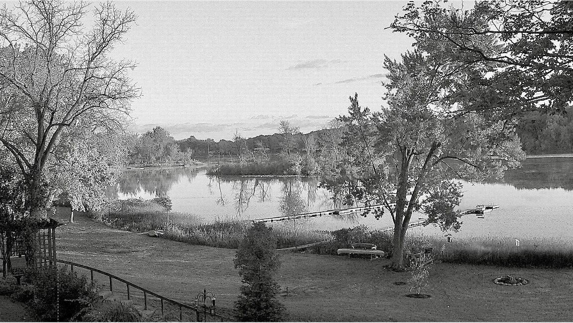
is this any better? messed with settings of above image in Photos on my mac. same size
When I open the lion image in lightburn it mesures 63.331 x 63.415mm as exported from gimp with no alterations made in gimp from downloaded image you posted.
When I load directly from downloaded image to light burn it mesures 197.884 x 198.148mm.
How come that.
What are the pixel numbers? Are the both the same? One could actually convert pixel count to mm.
The other could be using display size, because an image has 2 things the display size and the actual pixel density. That’s why I why you could have an image 60mm wide at 600 DPI and the same image at 60 mm at 30 DPI. I know that in Photoshop you can tell it work area size 60 mm and when you save it you that image will display as 60 mm, but you also define resolution in photoshop for that image. I assume GIMP does the same. This why you can scale the high DPI image and it still looks good, but you can’t scale up the low DPI because it pixelates. High res vs Low res.
So if all I want to do is show it on screen I would tell it to use say 72 DPI and it will look great on screen, but will print a garbage picture. I I told Photoshop I wanted a 60 mm image, but at 300 DPI it would look the same as the other image on screen, but would print a nice image. More data behind the scene..
That’s why I gave the size in pixels, because I can’t control display size.
Even when I get an image and ask to a 63 mm image it gives me a screen size image I ask for, but at 300 DPI/pixes per inch unless i request it in a certain DPI size or say Display only.
I hope that makes sense
Why you get 2 different sizes, it must be what the software is looking when you import it. Open the images in adjust image and see what the pixel size of both images shows. In theory they should both be the same. The size I showed above the image.
In theory they should print world you would want the image you put in a publication is actual size @ 300 DPI. That makes for a good 120-150 line halftone. In theory they should laser world there are so many variables to consider. The are power/speed, grayscale/dither, material, etc. even what type of laser diode, IR, etc..
RABBIT HOLE.
I’ll have to see what goes on on my Mac.
Update to come.
Notice the image px dimms difference in this first image, even though it’s the same image both sides.
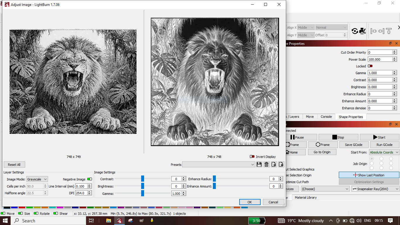
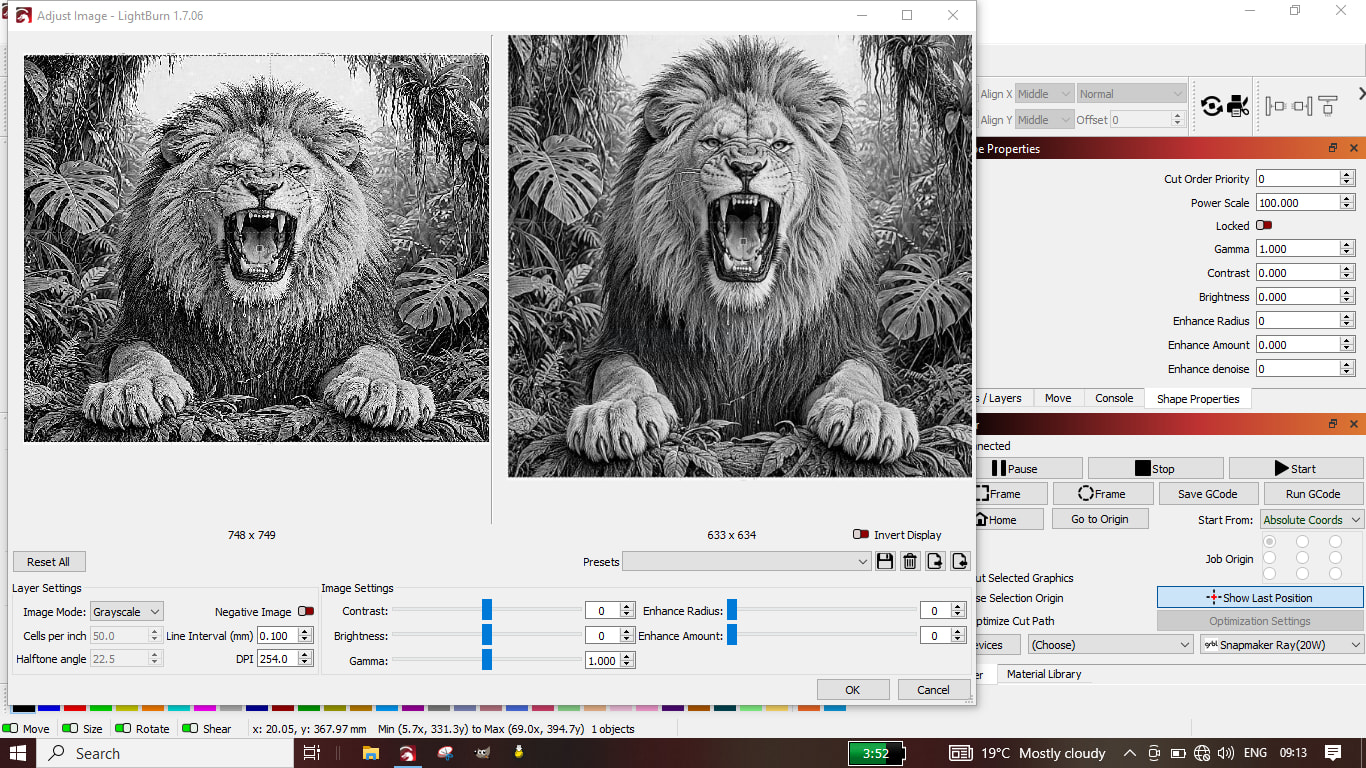
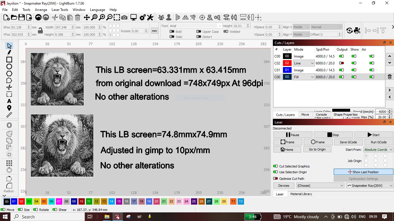
Remember the more data the image is great, but if you have enough pixels in an image for a good image at 10”, but you only are going to us it at 5” a lot of that data gets thrown away and uses up computer cycles figuring out what to throw out. An awful lot goes on behind the scene in the GPU (graphis processing unit).
I bet on the first 2 side by side images are 2 different sizes in theory work area.
The one on the left is x pixels wide. The one on the left will appear more pixelated and larger.
No make the small image bigger by dragging it or resize it to say 10” then look at that right side image. It will be really pixelated.
That is what I was trying to explain in the above statement. Making an image bigger in photoshop will try and create new detail, because it has the algorithms to do that, but before Ai it would make the image soft, but not pixelated.
LB doesn’t have that ability, so a single pixel will be made bigger and shows up in a pixelated image.
This is what I did. I took the original color image that was in my email (I moved it from my iPad to my Mac).I dragged a copy from email to LB it came in as on screen 2.5” wide 640 x 360.
Copied same image from the email and pasted into LB in adjust images 640 x 360, but the screen image is 8.88 wide.
Save image from email. Imported that into LB in adjust images is 2560 x 1440 and on screen is 10.07”. This is the actual high res image. The others are based upon what was displaying (screen resolution, probably 72 DPI).
Dragging image on screen shows a 2.5” image.
Copied image looks at the dimension of the image, but not at pixel resolution, hence screen shows 8.8” image.
but the imported one looks at pixel dimension and the converts that info to show you a pixel for pixel image on screen 10.07 image.
I have imported images into LB that were over 33” once on the workspace.
That is why when you asked for a specific size image of the lion I can try to get close, but not exact. I am doing a screen capture at 72 DPI, and how large I can display it.
I hope this make sense. I had to deal with this in the print world. We had customers send us files, and the really didn’t know what we really needed. They thought WYSIWYG was all that mattered.
Try explain that to someone who never used a computer, and was told to produce a newsletter. They had enough trouble understanding page layout software, and the company would spend the $ or time investment for the to learn it. That is why in the beginning of desktop publishing revolution a person mad a lot of money. $5 a page and $5 an image or more was common. Imagine doing a 64 page magazine filled with pictures. That could cost $1000 for a couple of days work. Books were even more. You could easily make $5000 for a single project, and sometimes you may be working on 2 or 3 projects at one time.
Still a good money making job, but not like it used to be. Just glad I am retired.