How the file was created and what format and such. It was said at the very beginning. And if a person asks about it, most likely he has not read it. Although I may be wrong
While this is fair, we must assume people ask for things to be able to participate and engage.
If you do not wish this to be a community-driven discussion - or are short on time to discuss publicly - I strongly suggest continuing this discussion via support@lightburnsoftware.com.
Let’s keep the tone light and friendly, please.
1 Like
I meant the specific file in the post above mine; the concentric circles. It hasn’t been posted before, there is no information on it. The patterns generated show a very specific behaviour and I’d like to confirm my hypothesis before posting about it. The files would be very useful to have, as without them there are a lot of unanswered questions, and waiting for a reply slows things down immeasurably!
2 Likes

I completely agree with you. And I will explain why I answered this way. It is just that the same questions lead to contamination of the thread and it becomes difficult to read. And it also leads to discussion of topics unrelated to the question. I did not want to offend anyone or be rude. Plus, my English is not very good and I may not convey my thoughts quite correctly.
1 Like
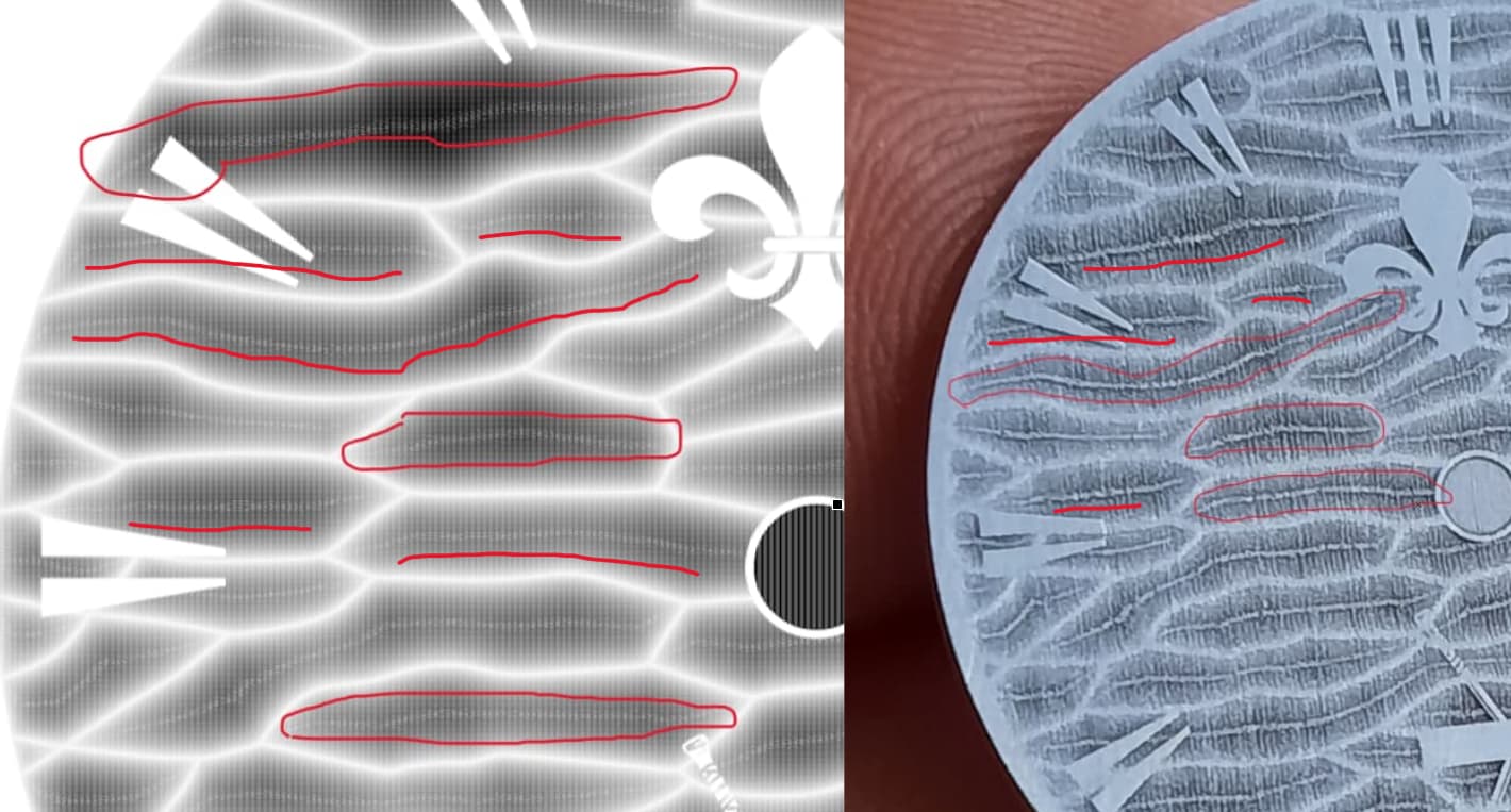
What is the simplest design you have that produces this issue? The amount of data generated by your fleur de lis image is a lot to wade through, and therefore difficult to pinpoint the source of the issue.
Edit: I’ve isolated a single section out of that image using a paint program and will keep looking. This will hopefully be simple enough for me to figure out what’s happening, but it might take a bit.
3 Likes

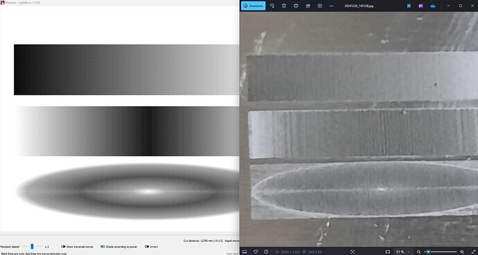
I am not seeing your issue in the Preview window. Is it possible it could be caused by your monitor or video board?
I also returned it back to a circle with the same results.
The preview is a red herring - Ignore it. The artifacts shown in the preview are a result of aliasing, and are trivially fixed by simply zooming out:
The errors on the job run by the laser are the entire problem. The fact that they look similar to the artifacts on the preview is a coincidence.
1 Like
I suspect this issue might be one of command throughput on the hardware. There is one difference I know of for certain in how EZCad processes images, compared to how LightBurn does: EZCad sends a “draw” command for every single pixel in the image. LightBurn batches them into runs of identical pixels.
So, for example, if you have 8 pixels in a row that are all the same shade, EZCad sends 8 identical “draw a teeny line” commands in a row, and LightBurn will send a single “draw a line that’s 8 pixels long” command.
I assume that the board is only capable of processing commands at a given rate. It’s quite possible that at very high DPI settings, you are exceeding that processing rate. If this is the case, EZCad’s method of sending a single command for every pixel would produce very bloated data going to the laser, but it would all be processed at the same rate, limited by the command throughput.
In your image, the center area is the most likely region to produce longer runs of identical shades. If LightBurn sends a single command to draw a run of pixels, the controller card would be able to handle that one command faster than the “discrete” commands sent by EZCad, which could make the laser pass over those areas faster, resulting in a lighter burn there.
In other images you’ve shared with problems, it’s seems to always be areas with solid shading that are having these issues.
This is my working theory. The only real way to test it is going to be to change how LightBurn generates command data for grayscale images. I have a couple ideas for how to change this without having to rewrite a ton of code, but I also have an out-of-country trip coming up next week, and I doubt I’m going to be able to do this before then.
8 Likes
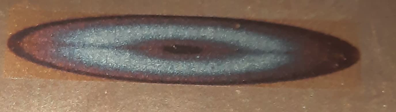
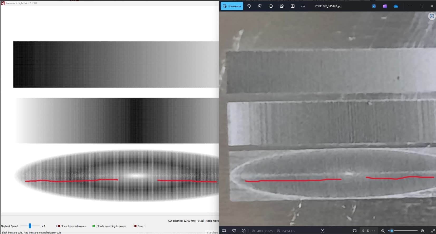
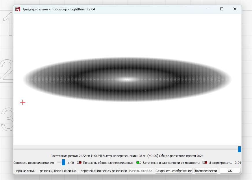
In the preview you can see a lighter area in this place and this area is also on the engraving. What kind of distraction is this?
And there are many examples. What do I need to provide you to prove that this is a problem, and it is not just me?
After all, the drawing of this problem does not depend on the control board.
I can connect more people who use your program and who also started testing it, getting the same results as me. Everyone has different equipment. When we talked about this, they said that they did not see this problem, since they did not use this mode before
Hi Sergey, I have following this thread for a while, and I understand your frustration however not sure if you understood what Oz just wrote. He seems to understand your question and will work on a solution for this issue.
I also have the feeling that you are right to say that the preview is better than expected and in fact showing a lower output power as a result of the shorter commands.
I understand all of this and I am not rushing you in any way. I just wanted to show that this is indeed a problem and I am 90% sure that it is in the code. And I did not want to offend anyone in any way.
3 Likes
I’m just trying to show that the problem is not in the equipment. And I distinguish between moire and those artifacts that appear, these are different things.
hi Sergey, I understand what you mean. All good with me. It is good that you found this strange thing and may even convince me to use greyscale every now and then ![]()
2 Likes
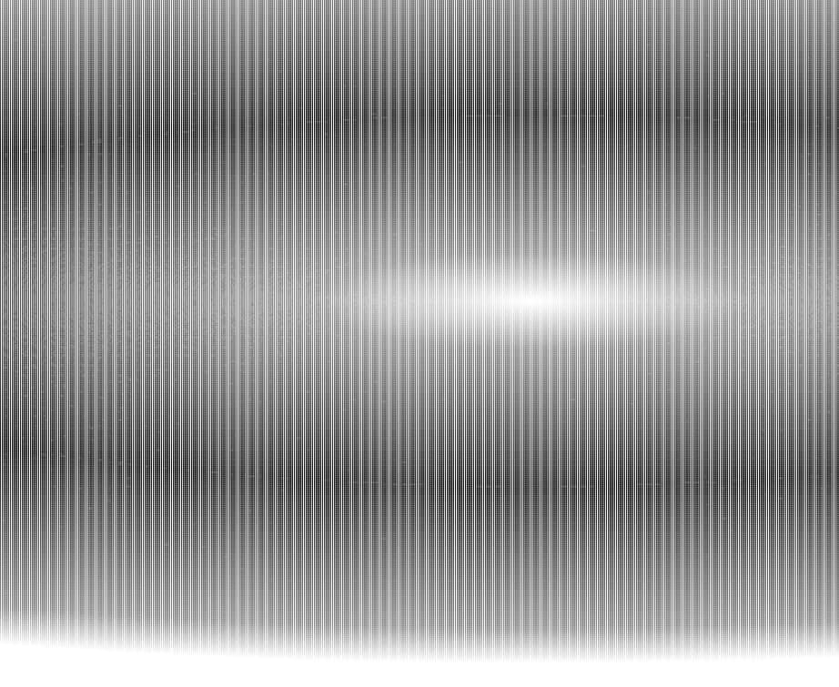
As mentioned by Oz, the image preview is affected by an aliasing effect. The combination of image resolution, screen resolution, scaling, and whatnot, can affect how the images looks, and cause ‘artifacts’ like the one you’re seeing on screen.
(fun example here, try zooming the page on this image, and watch strange patterns appear that aren’t actually there: https://blogs.mathworks.com/steve/2017/01/03/aliasing-and-image-resizing-part-1/)
The issues that show up on your material are real as well, but are caused by other means, likely the ones mention by Oz. That they correspond to the image preview is coincidence. The fact that they seems to match makes it confusing though, and might make you think the review is showing reality, which in this case it’s not.
Hope that makes sense.
3 Likes
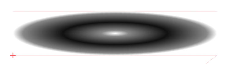
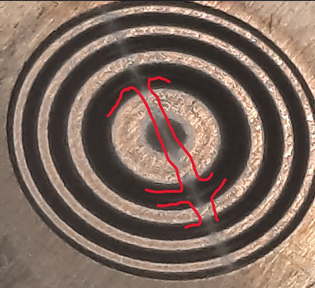
Here is your drawing from the link you gave. I am already tired of explaining to everyone. You are trying to tell me about distortions that occur when visualizing drawings consisting of many different lines, as it looks in Figure 1. I am talking about something else. In the Enlarged version, there is a dark area between the light central circle and the outer circle. And in the middle of this area there is a light area, and it will be visible during engraving (highlighted in red). This gray area also extends to the top and bottom. Therefore, I repeat, I do not know how many times, that this is not a distortion when visualizing the drawing. These experiments were carried out not only by me on my machine, but by several other people and they got the same results. I just do not understand that I am not explaining clearly every time if they try to prove the opposite to me. Then also carry out these experiments on a laser, compare the results with the preview, and if this is not so, then yes, I am wrong.
I also made an engraving of your example. I did not engrave everything, just a piece from the middle.

1 Like
Just updating the topic. The problem exists, but there are no answers.
I figured this wouldn’t take very long to verify my hunch, so I quickly coded up a test, and here’s the result:

Image on the right is the original code, and image on the left is the modified code.
Now here’s the fun part:

The image is the middle is running the same code as the one on the right, I just set the speed to sane value that the board could actually keep up with. (in this case, I used 100mm/sec, which is about what I measured the other code doing)
In one of your images above, you posted these settings:
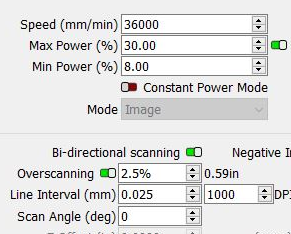
36000 mm/min is 600 mm/sec. Using an interval of 0.025mm, that would be 24000 pixels per second, and each pixel needs a “set power” and “line to” command, so that’s 48000 commands per second that the board has to process.
It appears that the hardware limit is much lower, particularly for the “set power” commands. So, merely setting the speed to something the board is capable of processing “fixes” the issue.
All my new code does is output a “set power” and “draw line” command for every single pixel in grayscale mode, instead of trying to produce less data by sending out longer runs when all the pixels are the same.
So, it’s not really a bug, you’re asking the hardware to exceed its abilities, and the EZCad2 software gets around the problem by simply masking it, and forcing the board to run at the same slow speed for the whole image.
I knew this had the potential to be an issue, but coded it the way I did because I figured you could just request a lower speed to fix the problem (which I’ve now verified), and the way EZCad does it consumes a lot more memory.
So you said, “I bet the problem isn’t with my files…”, but it kind of is - You’re requesting a speed that the hardware isn’t capable of. If you reduce your speed to 100mm/sec (6000mm/min) I’m betting the problem is no longer visible.
5 Likes
The bet continues.
First: Please show your original test image.
Second: For some reason you don’t hear me, I explain the same thing many times and all the answers ignore it.
Namely: Coincidence of gray areas on the preview and in the metal.
I started to describe all the examples again, again, adding new ones. But then I realized that it doesn’t make sense because, as I said above, all this is ignored.
Explain why the artifacts on the preview lie with the artifacts on the engraving? Just spare me the stories about optical effects. I wrote about them above and attached images.
I realized that for the sake of one person, it makes no sense to work on this function. But you can’t even imagine how great this function is and what possibilities it gives when engraving. And it’s a shame if it remains unfinished.
By the way, here is the engraving at a speed of 100 mm / sec. The problem remains. And if you look closely at your average result, you’ll see that this problem is also present there. It’s just slightly disguised by an over-exposed image.
That’s all I have. But I’d really like to get an answer to the question posed above.
It shows a gray horizontal stripe. Here is the engraving at 100 mm/sec. The same stripe.