I like the script font in general but having some of the descenders on the lower case letters like “j” “p” and “f” make it hard to come up with ways to use it. For some reason “y” and “z” and “g” are just fine. I would love to see this fixed so I can use that font.
thanks
Can you provide an example screenshot and what actual font you are using? LightBurn does not provide any fonts - they are either installed on your system or provided by you to the SHX font system. There are lots of script fonts, so not sure what you are referring to here.
1 Like
The name of the font is “script”. It is a Dell computer. I have no additional fonts installed. thanks
Do you have a visual example in the form of a photo?
Sas
Sorry for the delay - we had a trip to go on:) Please see the image.
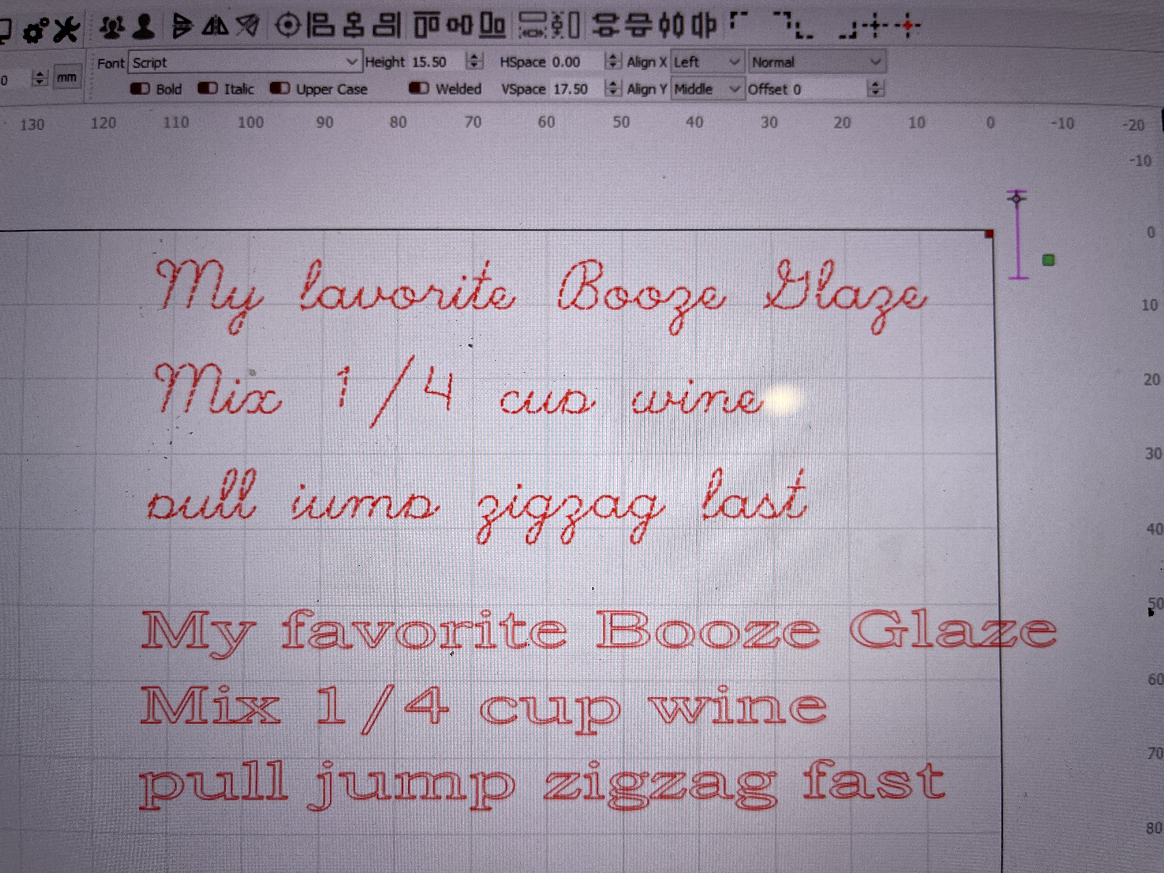
The top row of text is in the “Script” font and the bottom block of text is the exact same text block with the font changed to century schoolbook.
Any ideas will help. I have a project to burn this guy’s recipe into a cutting board and this font is close to his handwritten recipe but scanning the handwritten on looks crappy.
Thanks
George
I’m able to reproduce this not just in LightBurn but in a few other applications as well with the same font (I’ve realized now it’s just a standard windows font).
The problem is likely that, because it’s a script font, the lines are very close together and as far as I can tell this is a problem with the underlying framework we use and not any specific LightBurn code.
Granted, there’s a much better way to do script fonts now and that is single line (SHX) fonts:
https://lightburnsoftware.github.io/NewDocs/FontsAndText.html#shx-fonts
There’s a few forum posts already where people have posted collections of SHX fonts you can download, like this:
Using these fonts would likely make for a cleaner burn as it won’t have doubled up lines like the the font you are currently using.
Thanks - I will check it out and see what they have. I had not heard of an SHX font before.
Thanks
George
1 Like
This topic was automatically closed 30 days after the last reply. New replies are no longer allowed.